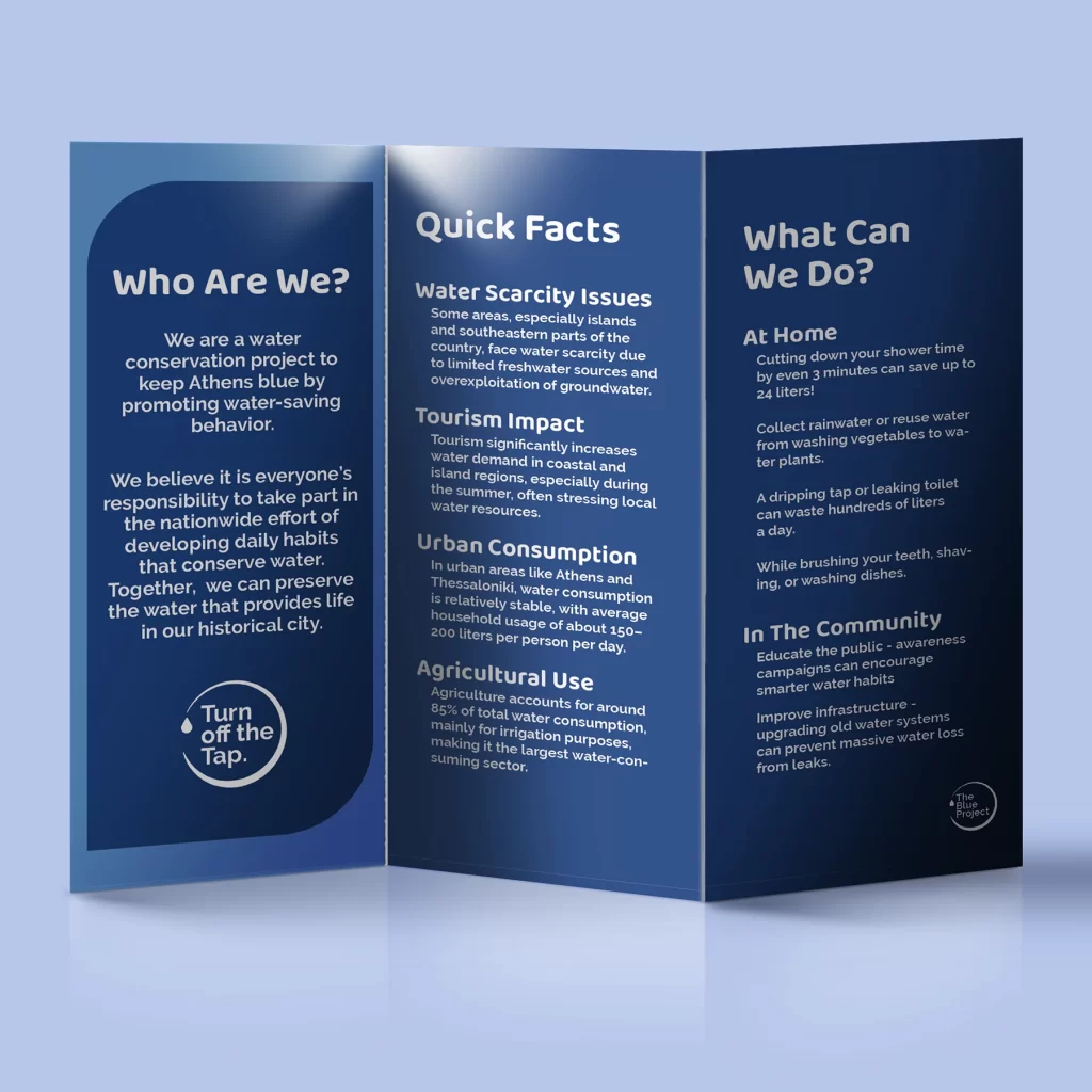
The Blue Project is a fictional water conservation campaign in Athens, Greece designed for Graphic Design II course. The goal of the project was to design a flexible identity system for the campaign the would work across all platforms, digital and physical.
The identity I created for this campaign reflects the togetherness and solution-focused aspects of the campaign. It is designed to create a cohesive and memorable visual presence across all materials. Whether it’s an outdoor print, or an Instagram post, the campaign’s message inspires action and builds trust.
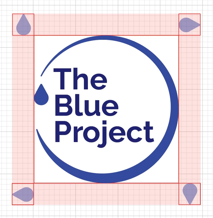
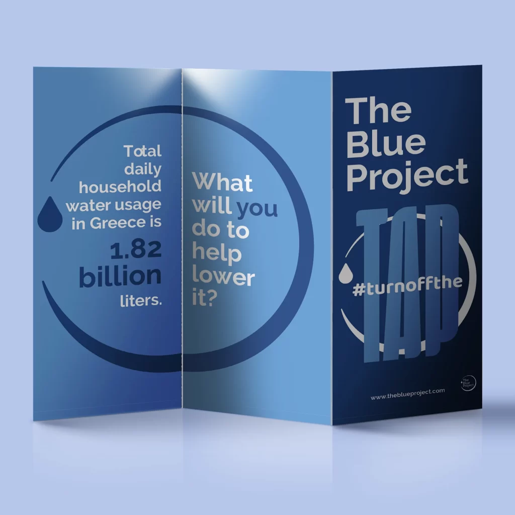
The logo for The Blue Project was designed with flexibility at its core, allowing it to adapt seamlessly across formats without losing its impact. Its circular shape represents the importance of togetherness in water conservation.
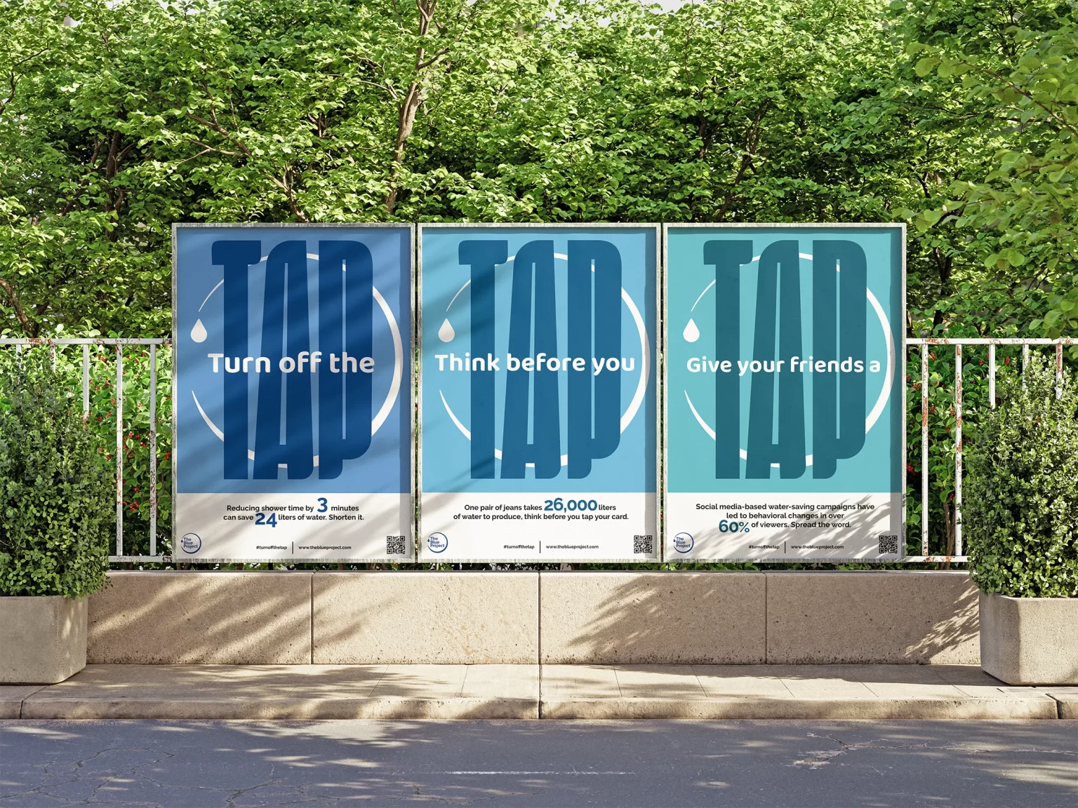
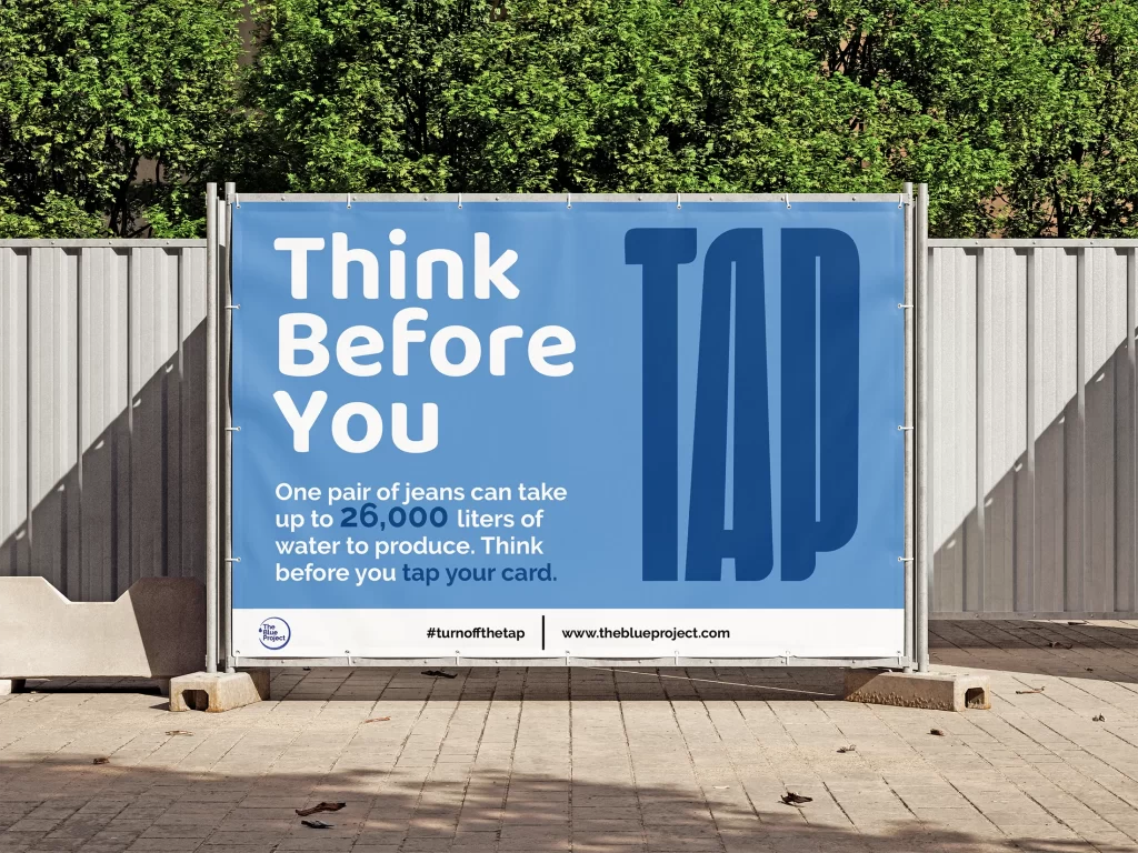
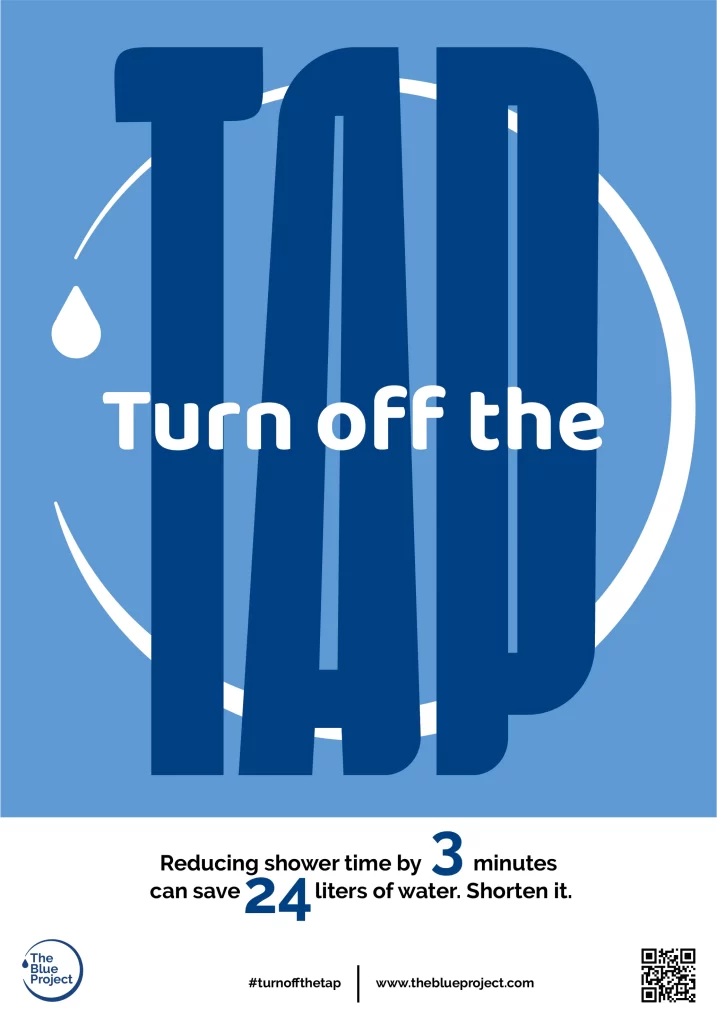
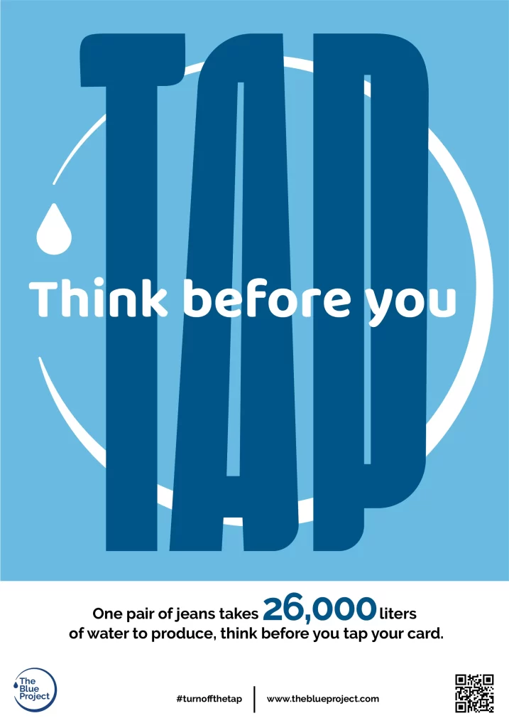
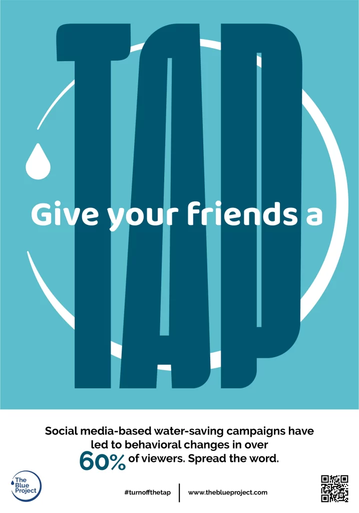
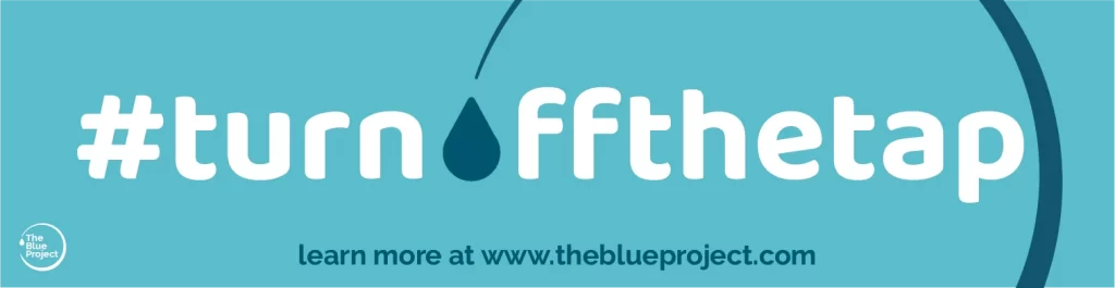
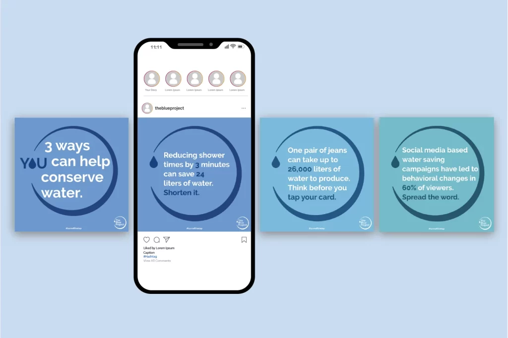
Elements from the logo are applied to other designs in the campaign to create a strong visual language. The circular shape with the water droplet are incorporated into the poster designs and social media posts so they feel connected to the larger mission of the campaign.
The campaign appeals to a younger audience, due to their commitment to social change. Certain elements such as the use of a catchy tagline, QR code, and phrases like “think before you tap” resonate with the everyday actions of young adults, but are still understood by the general public.
Multiple meanings of the word “tap” are conveyed in the three posters, each describing a different method of saving water. This design approach allows the posters to stand alone, or as a set of three. Visual elements from the logo are incorporated into the design, further communicating the flexible identity system.