Collaborated with the Director of Operations to redesign the logo for improved versatility, cost efficiency, and brand consistency. The updated design features a modern style optimized for both physical and digital applications, ensuring clarity, scalability, and ease of reproduction across various touchpoints.
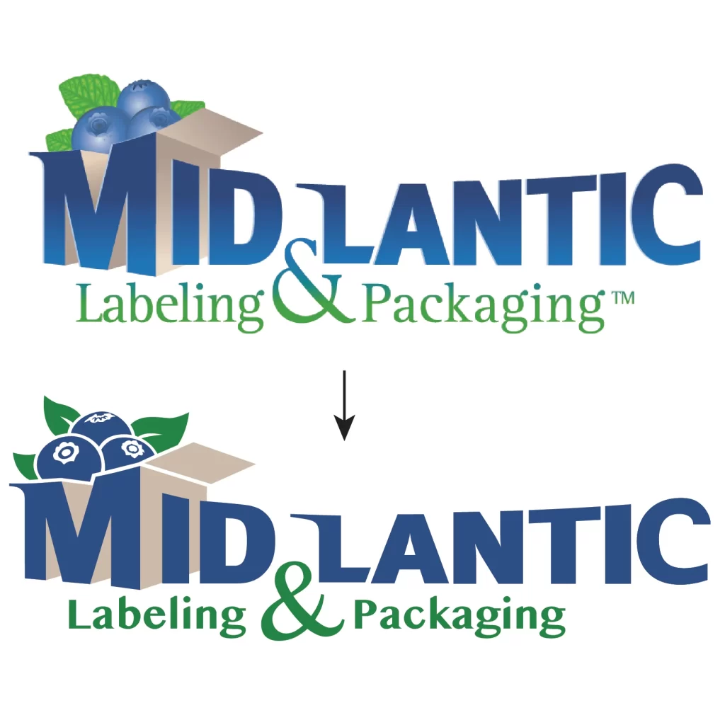
The client needed a logo with a more modern style with 2-3 colors, but no significant changes the overall design of the logo. I took these requirements into consideration and created a few variations of the new logo to send back to the client.
Original Logo
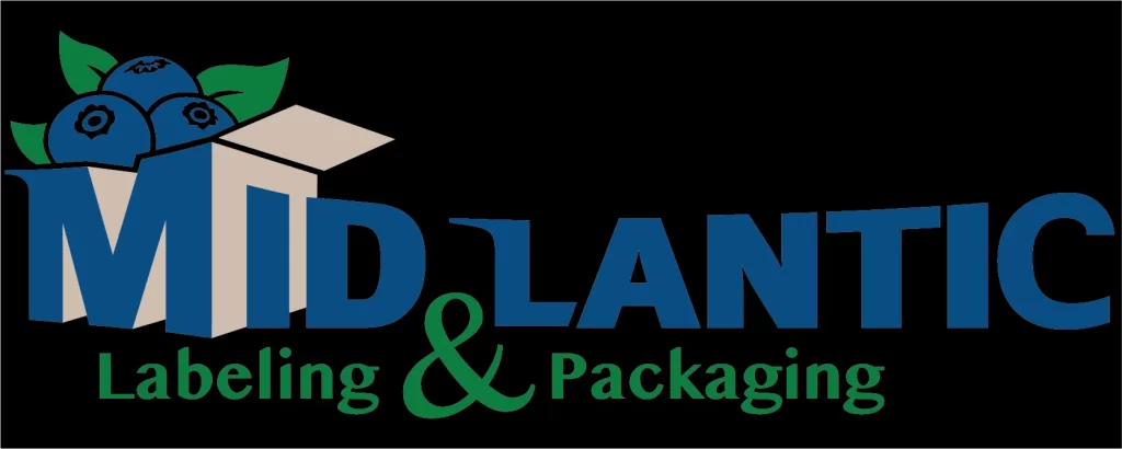
New Logo on Black
New Logo on White
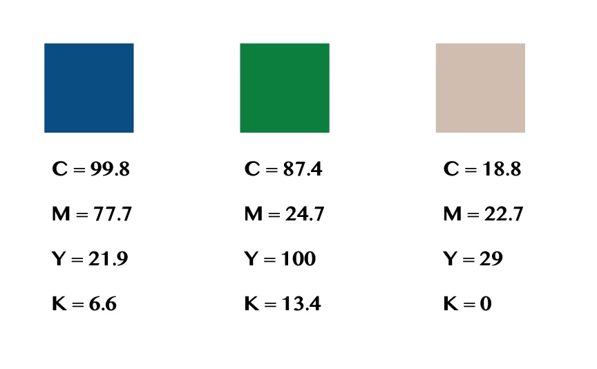
The original logo contained a gradient style that is outdated, so I changed the logo to flat color to give it a more modern look. For “Labeling & Packaging” I chose a bolder font with less serifs to complement the flat design approach, and improve scalability.
The logo also needed to be limited to 2-3 colors in order to be cost efficient for printing. It also needed to be easily readable on black and white backgrounds, as it would be printed on black shirts and white trucks, and displayed digitally throughout the website.