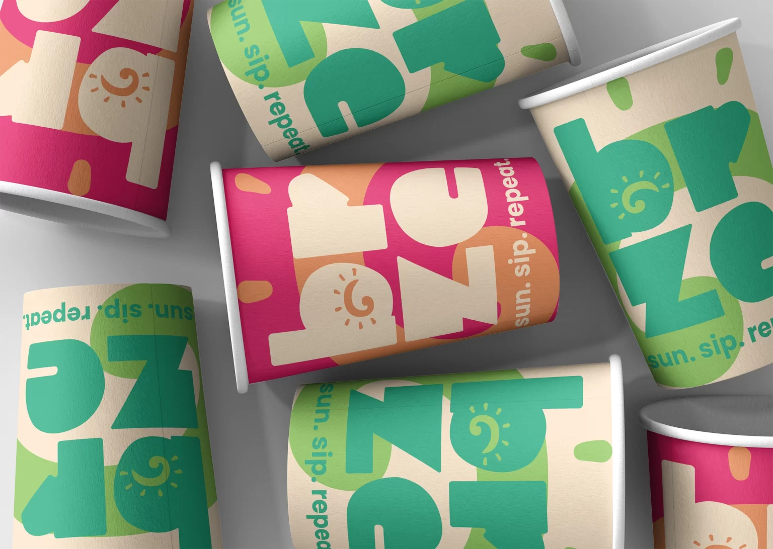
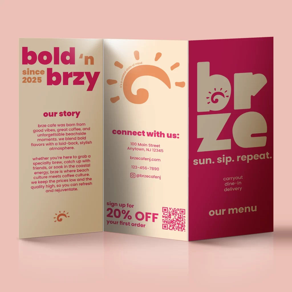
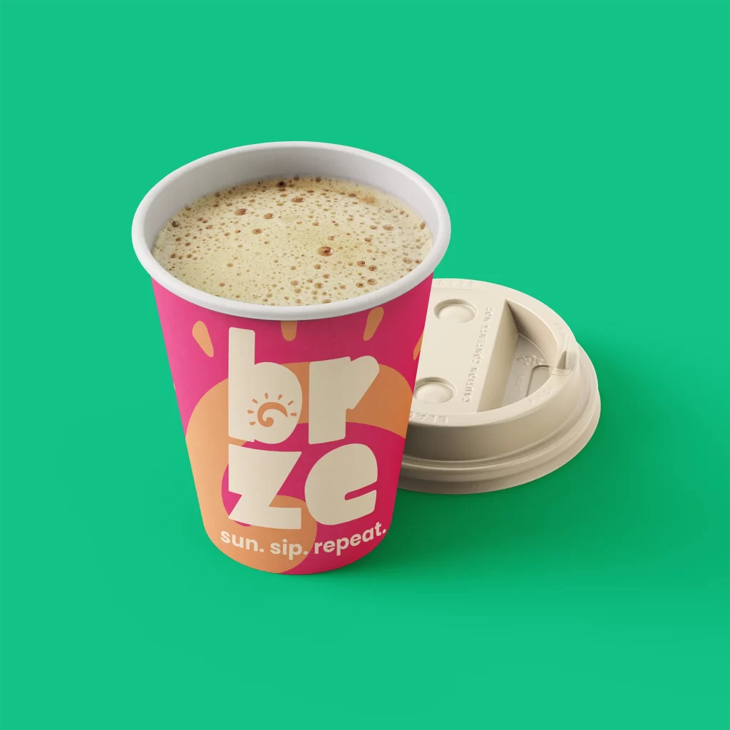
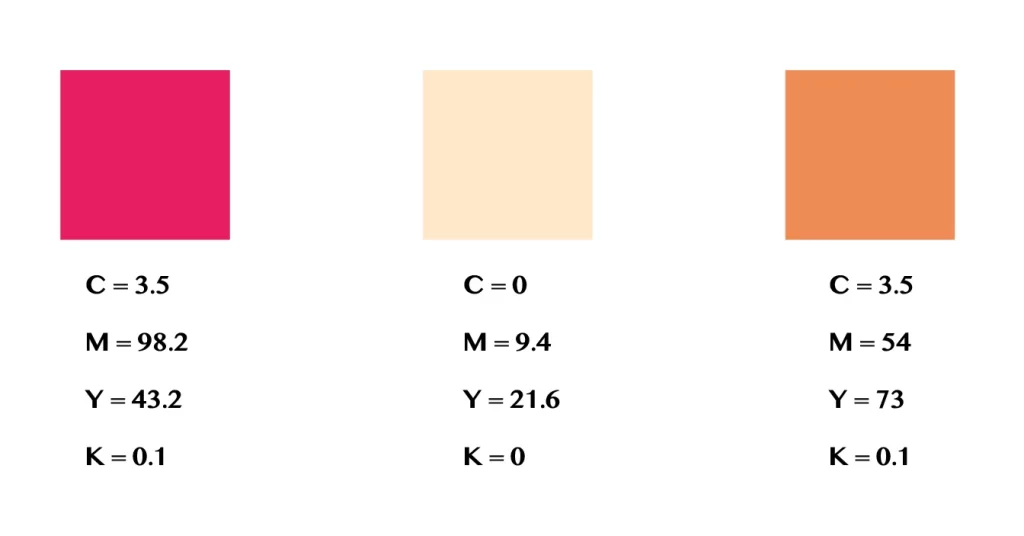
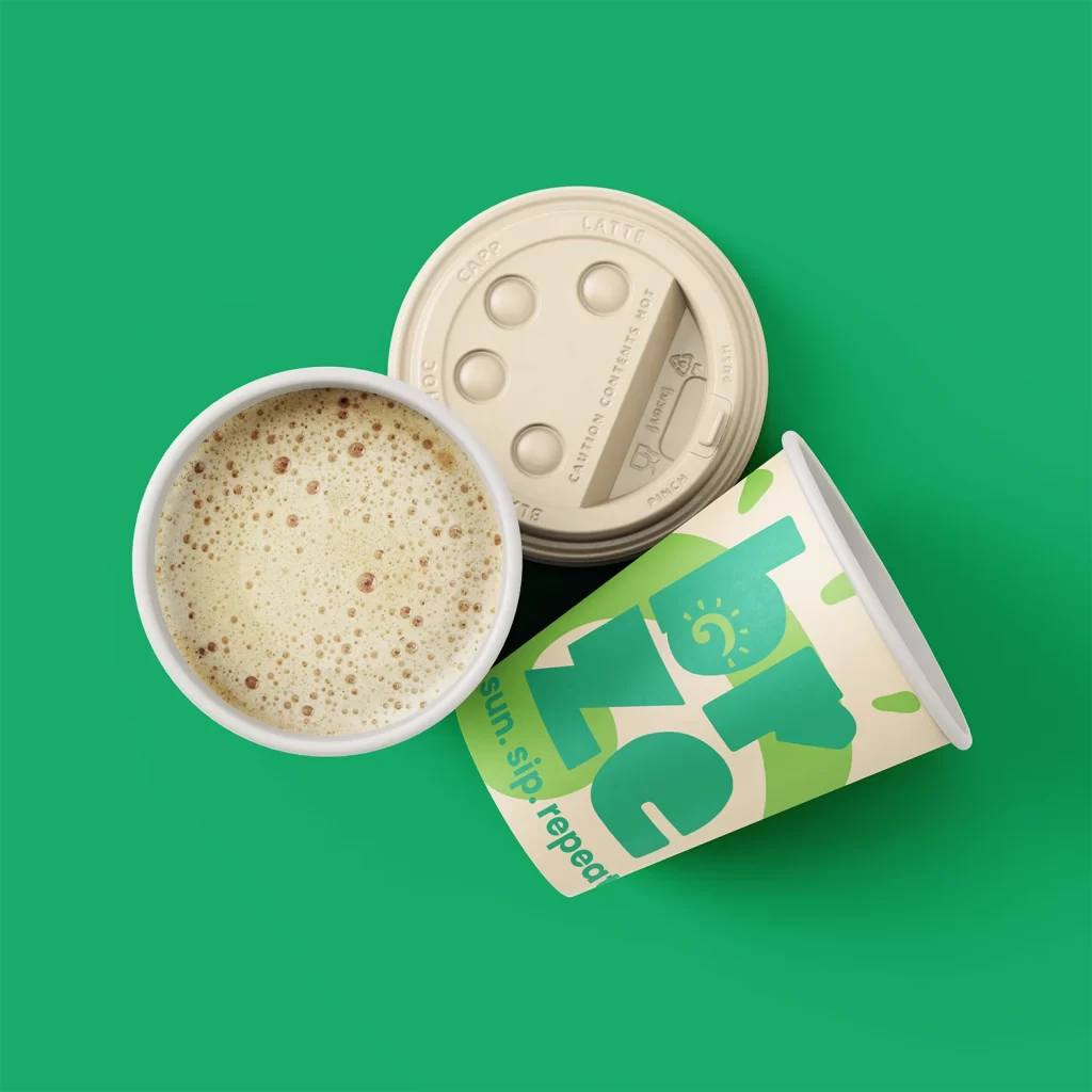
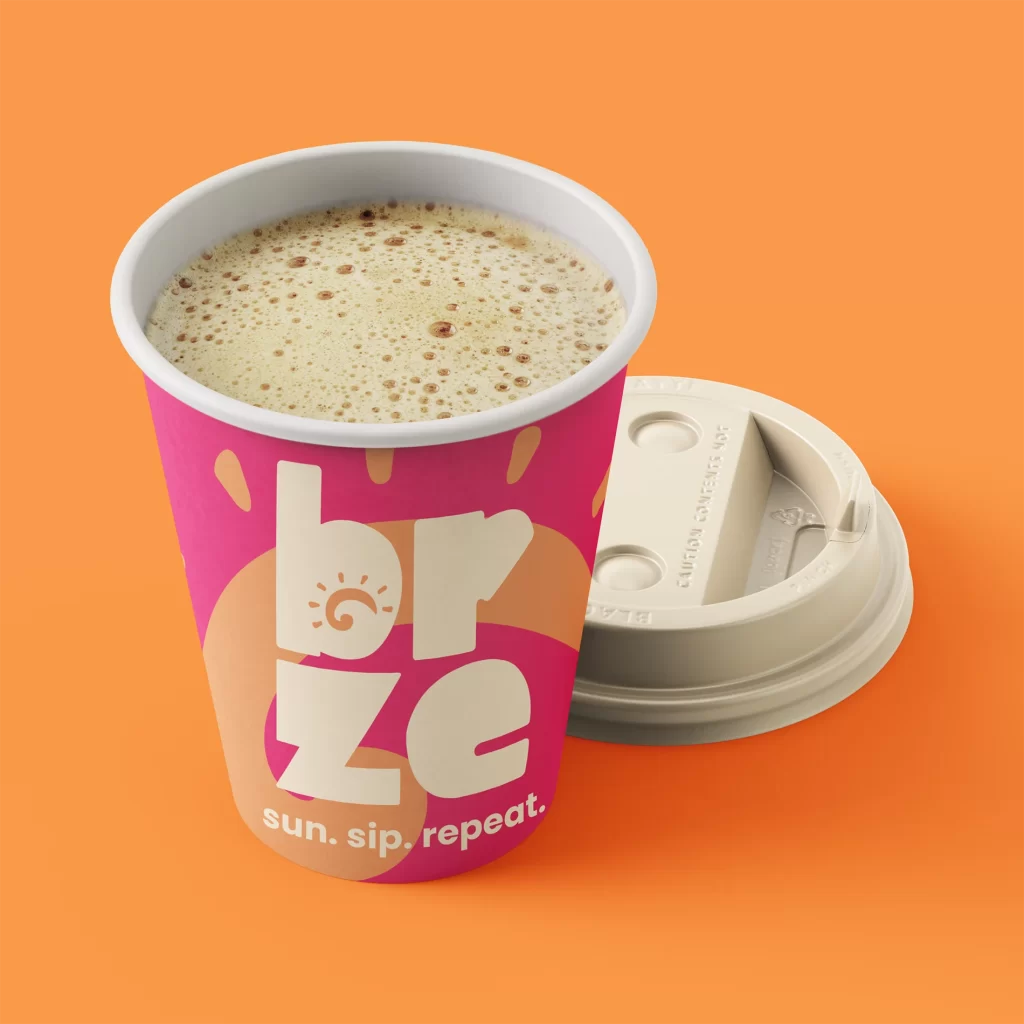
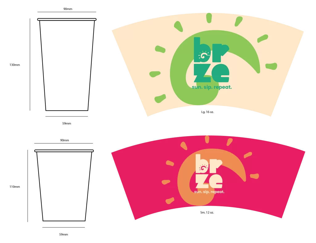
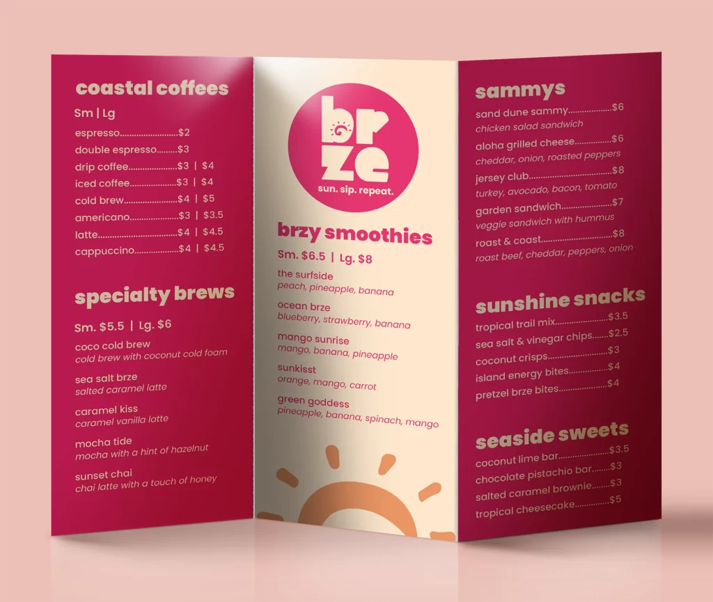
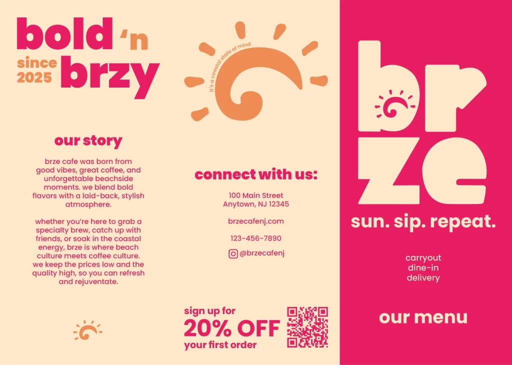
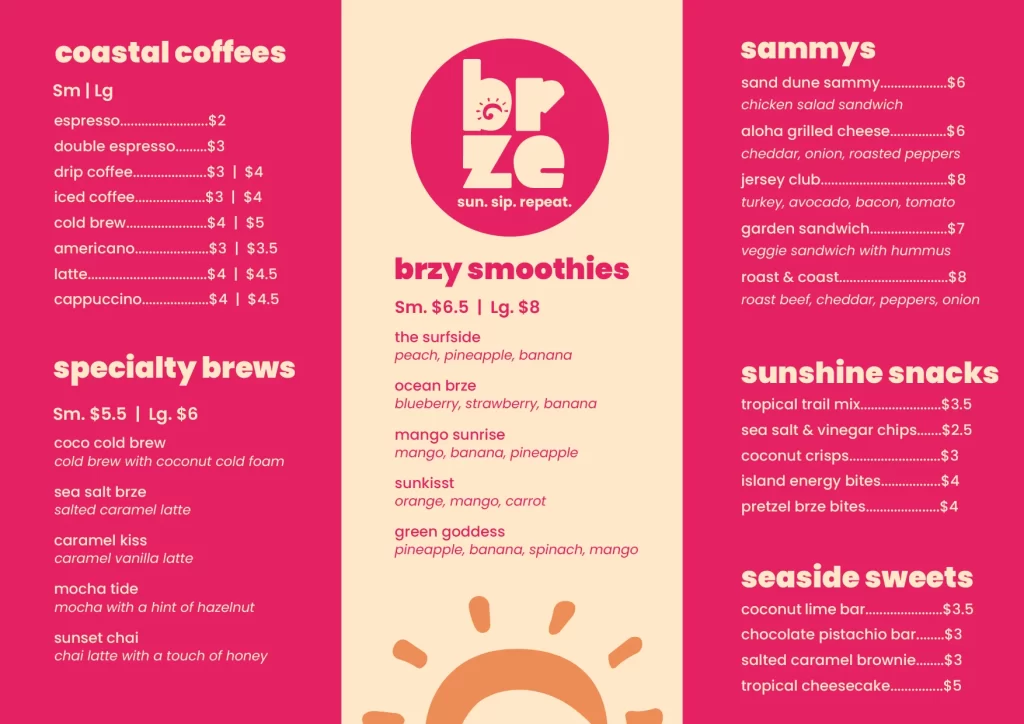
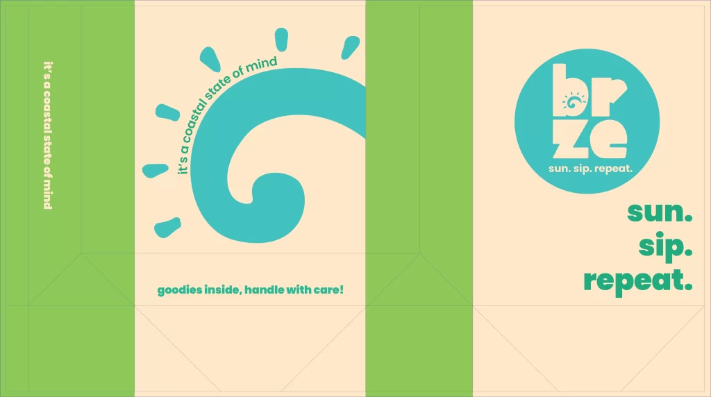
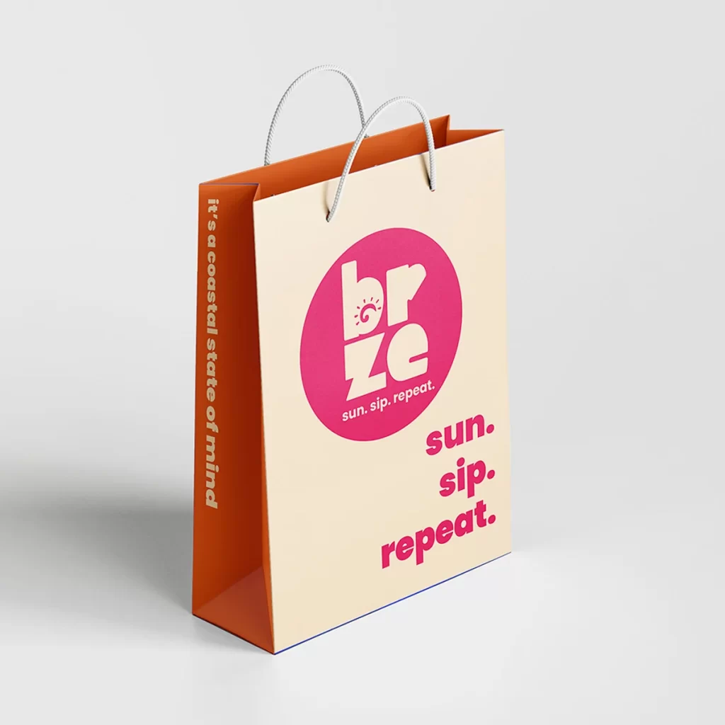
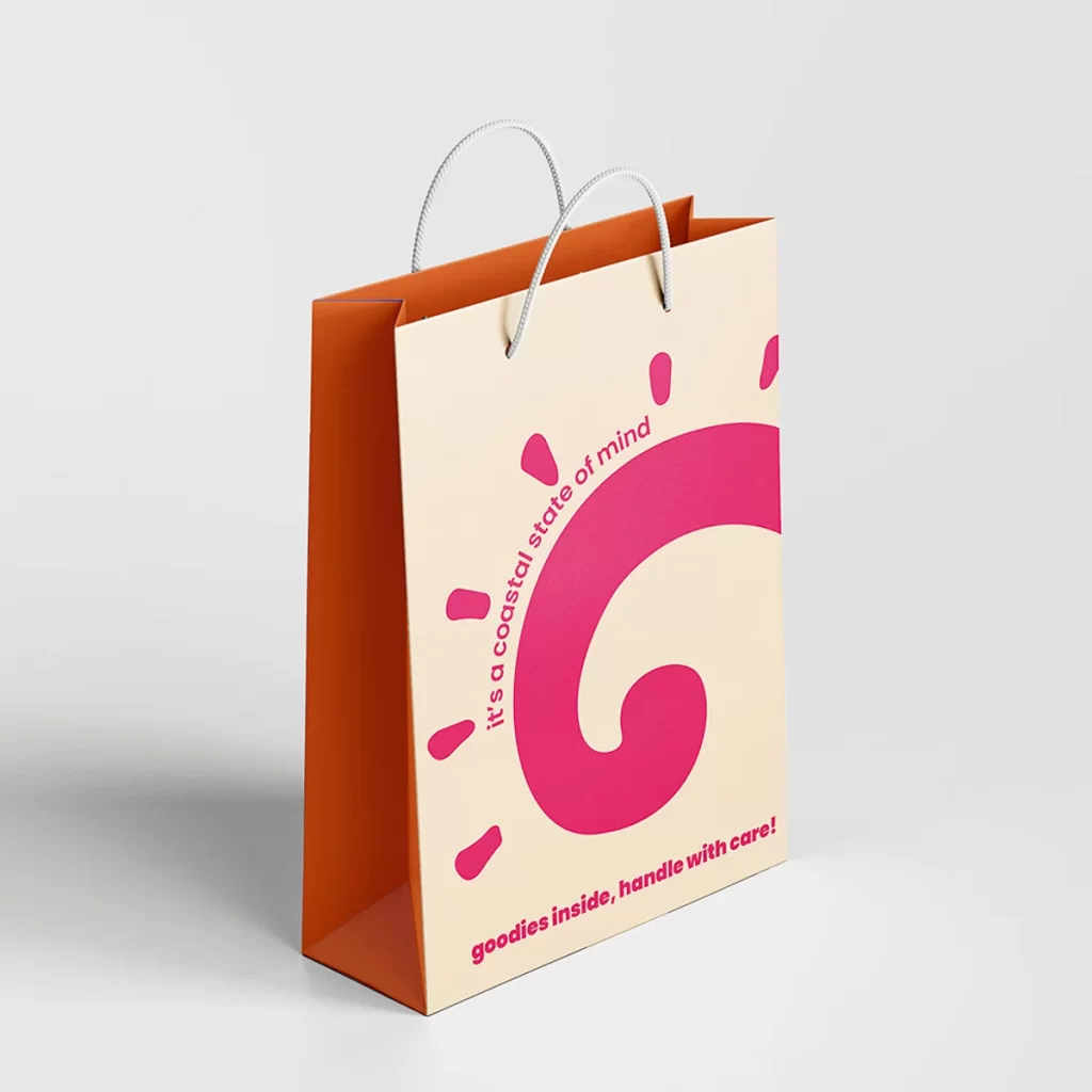
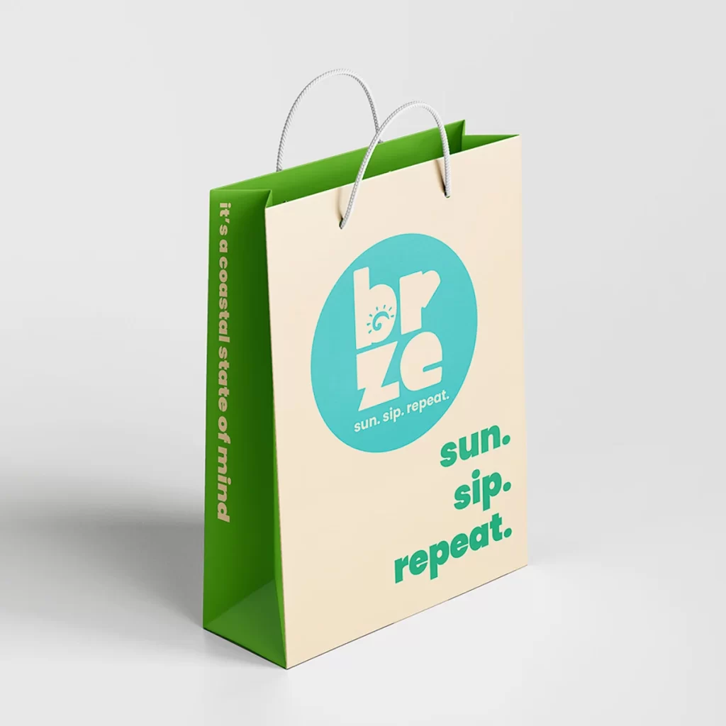
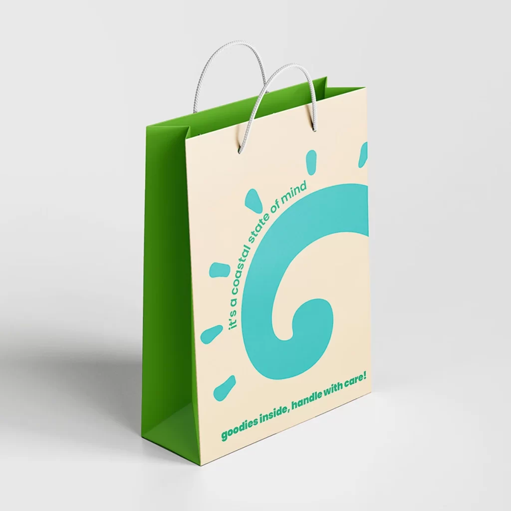
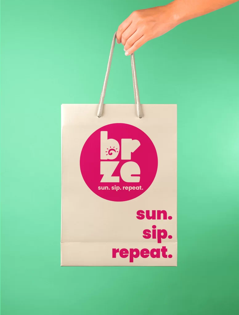
brze is a vibrant branding and packaging project designed for a branding ecosystems course. The brand identity captures the coastal energy of the cafe by featuring bold, playful typography in combination with lively beach colors. The packaging elements are designed with a stylish yet laid-back look, reflecting the social and trendy aspects of the cafe.
Brand Strategy
Brand Positioning
Guided by a clear purpose, the cafe is designed to feel like a natural extension of the beach. Brze’s vision is to become the go-to destination for locals and visitors seeking a laid-back but trendy atmosphere. Every touchpoint reflects the brand’s core values: authenticity, a strong sense of community, and a commitment to freshness and quality. Through thoughtful and consistent messaging and packaging, brze cafe builds a lifestyle around connection and comfort.
brze cafe positions itself as the ultimate beachside hangout for young adult beach goers who create a stylish yet relaxed spot to socialize and recharge. The brand speaks to a generation that values experiences and shareable moments – both in person and online. With a strong focus on growing its social media presence, brze leverages visually appealing packaging and curated content to become more than just a cafe, but also a seaside lifestyle.
Brand Identity
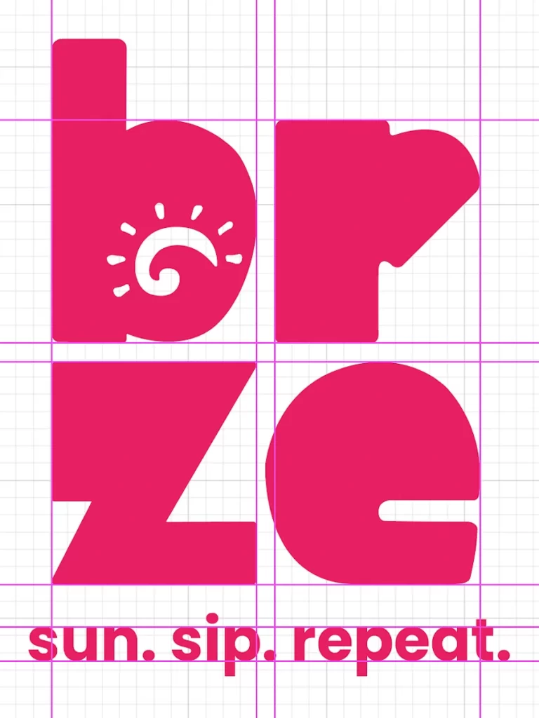
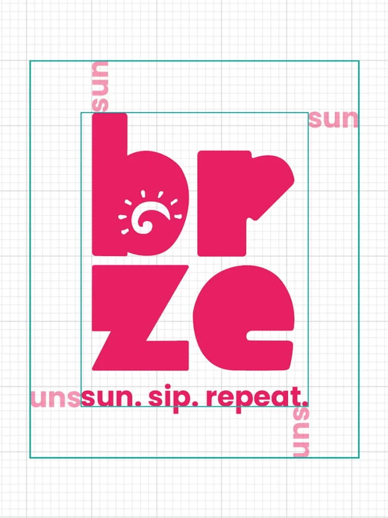
brze’s brand identity is rooted in the carefree rhythm of coastal living. The name is inspired by the relaxation of an ocean breeze, combined with a creative misspelled approach. The tagline “sun. sip. repeat.” captures the essence of the cafe’s experience: soaking up the sun, sipping a refreshing drink, and coming back for more. The brand story is built around creating a welcoming space with great coffee and snacks where everyone feels like they belong.